Marijuana is a controversial subject, to be sure. That said, as Washington state and others have legalized recreational pot over the past handful of years the industry has gone from being confined to the shadows to operating on full display in showrooms reminiscent of Apple stores and luxury car dealerships.
For the last two weeks, I've been immersed in a cloud of data surrounding the Washington marijuana industry, attempting to model the relationship between factors like online reviews and local demographics and a dispensary's reported revenue. While it's been a bit hazy at times, it's ultimately led to some enlightening insights. I'd love to share with you some of what I've learned while dabbling with Mary Jane, the model.
Abstract
In 2012, Washington state passed I-502 and legalized the recreational sale, use, and possession of marijuana. This has led to an explosion of development in the field that's making waves through our society. Since 2014, approximately 500 state licensed dispensaries have opened throughout the state, with nearly 150 of those here in Seattle. In this project, I scoured the web for publicly available data that might be predictive of how a cannabis dispensary performs, such as customer reviews, inventory distributions, and local demographics. I then trained machine learning models to predict a dispensary's monthly revenue and analyze the resulting models to distill insights about what drives sales in the marijuana market. For the full source code from my project, check out my GitHub.
Data Sources
- Washington State Liquor and Cannabis Board (WSLCB)
- Leafly
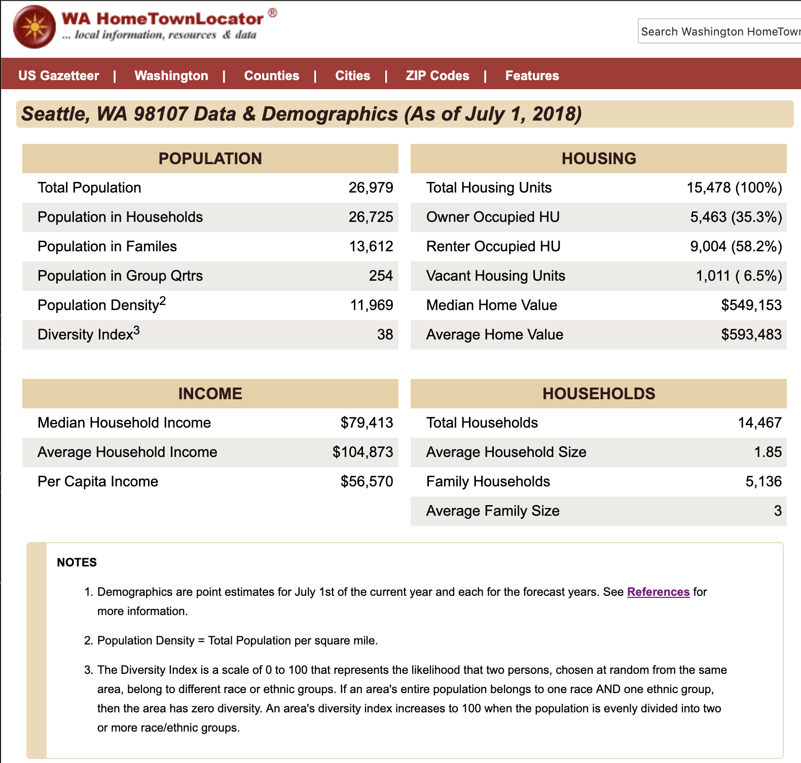
- WA HomeTownLocator
- Walkscore
Licensing and Sales Data from WSLCB
Lastly, all that data would get us nowhere if we didn't have any target data to train our models on. That's where the WSLCB comes in. The WSLCB maintains data on every dispensary in the state, including monthly reports of revenue (which is what our model is predicting). Their data is scattered across a couple of different outlets, but for this project I used spreadsheets downloadable from this obscure page to get sales data dating back to November 2017. Because the only identifying information in that spreadsheet is the license number of the dispensary, I also downloaded a spreadsheet listing metadata for every entity that has applied for a Marijuana license, which I then joined with the sales data in order to link it up with data scraped from other resources.
Dispensary profiles from Leafly
Leafly is an information aggregator for cannabis. They maintain a profile for most of the dispensaries in the state. As part of my dataset, I've scraped the following features from the Leafly website for each dispensary for which it was available:
- Average customer rating and number of customer reviews
- Inventory counts (number of products under descriptions like "flower", "edibles", "concentrates", etc.
- Categorical qualities, such as whether or not the store is ADA accessible or has an ATM onsite
- Metadata such as name, address, phone number, etc.
The combination of these features gives us a profile of each dispensary that allow us to draw insights from our model into what makes for a successful dispensary.
Demographics from WA HomeTownLocator
Of course, having the best inventory, friendliest staff and prettiest pot shop in the state doesn't amount to anything if a dispensary is in the middle of nowhere. This is where demographic data comes in. WA HomeTownLocator maintains a database of demographic statistics for nearly every zip code in the state of Washington. The data is produced by Esri Demographics, and updated 4 times per year using data from the federal census, IRS, USPS, as well as local data sources and more. From this website I scraped data likely to be predictive of a local market such as:
- Population density
- Diversity
- Average income
These data give our model an image of what a dispensary's customer base is like, allowing us to characterize what makes for a good location to establish a dispensary.
Walkscore
I also used the Walkscore API to query their database for scores on how easily consumers can reach each dispensary by foot or bike.
Tools
Code
- Python
- Jupyter notebook
Data exploration and cleaning
- Numpy
- Pandas
- Fuzzywuzzy
Modeling
- Sklearn
Visualization
- Matplotlib
- Seaborn
Web scraping
- Requests
- Selenium
Workflow management
- DataScienceMVP
- Cookiecutter
Obtaining the Data
The methods for acquiring the data for this project really varied significantly depending upon the source. Here I'll talk briefly about the methods I used for each source and touch on the difficulties and learning experiences I had with each.
WSLCB License and Sales Data
Other than actually finding this data, this was arguably the easiest piece of data to acquire for this project. If you go down the path of searching for dispensary sales data in the obvious place (the state's Marijuana Dashboard, which hosts a bunch of cool interactive charting tools to browse the data the various data that's been collected related to the marijuana industry), you'll be disappointed to discover that they basically stopped updating these stats on that page in 2017. No, it turns out that you instead need to go to the WSLCB's Frequently Requested Lists page, which has download links to a hodge podge of datasets. Meandering path aside, it's now just a matter of simply downloading two spreadsheets—one containing metadata for every marijuana license holder in the state (names, addresses, etc.) and the other containing monthly sales numbers for each license holder dating back to November 2017. My code automatically searches the page for the latest versions and updates that into the training pipeline.
Scraping Leafly
Getting data I was looking for off of from Leafly's website was by far the most difficult and complex task in acquiring data for this project. To tackle this, I split up the task into two primary functions:
- Getting a list of all of the dispensaries with a profile on Leafly, along with some basic metadata about each (most importantly, the URL suffix that points to the dispensary's profile page)
- Going to each individual dispensary profile and extracting specific data of interest available there.
It was really a project in and of itself, so check up my more detailed write-up on that here. With a couple dozen fields of data on each dispensary now stashed away in a JSON file, I could move on to scraping some simpler sources of data.
Scraping demographic data
Getting demographic data for each dispensary area was actually a bit more challenging than I expected. While US census data is publicly available, it's generally not provided at a very granular or intuitive level. After a good long time searching around different aggregator sites, I came across the Washington Hometown Locator website, which offers up data down to each zip code in the state.
From here, I wrote a simple script that would:
- Extract every zip code from my dataset of dispensary license holders.
- Generate a URL using each of these zip codes to point to the appropriate page on WHL
- Download the table data from each of these pages using the Pandas function pd.read_html. It was actually kind of miraculous to me how simple and effective this method was. Thanks to Young Jeong for the tip!
Getting walk and bike scores from the Walkscore API
It seemed plausible to me that I could leverage Walkscore's scoring of how prime a location is according to how walkable it is, and fortunately for me it they've got a public facing API that's free to access (up to a 5000 requests a day). This one was actually as simple as applying for an API key (took about an hour to get it) and writing a script to generate request call URLs by combining address, city, state, zip code, and the lat/lon coordinates for each location. The only complication is that I didn't yet actually have any single data source where providing me with all of this information. For that small reason I actually don't execute this step until late in the code after I've already done quite a bit of cleaning and merging of the data.
Cleaning, Combining, and Developing the Data
Merging data without a common key
Determining dispensary density
Exploration and Feature Engineering
Some of my favorite tools for exploring relationships in data are built right in to the Seaborn plotting library. Let me walk through some quick examples of how I use jointplot, heatmap, and pairplots to identify trends in the data and give me clues on how I ought to transform my features.
A jointplot for each feature vs target variable combination
Jointplots are a pretty slick wrapper on the JointGrid class where with just a quick switch of a parameter you can get a variety of plot types (scatter, regression, residual, kde or hex) that display a nice amount of information. For my initial explorations I used jointplot to display a scatterplot with univariate regression line for every feature compared to my target variable, target_sales, along with kernel density histograms for each variable. An example and the code to produce it are shown below:
sns.jointplot(
    x='number_of_reviews',
    y='total_sales',
    data=data,
    height=10,
    ratio=4,
    xlim=(-100, 1750),
    ylim=(-10000, 1300000),
    kind="reg",
    joint_kws={'line_kws': {'color': 'r'},
               'scatter_kws': {'alpha': 0.25}})

There's quite a bit we can learn from just a quick glance at this plot (and many others like it not produced here). For starters, that best fit line doesn't look like it fits very well. It seems we've got the majority of the data all scrunched up in the corner and a cloud of outliers fanning out in a rather thin fashion from there. A look at the histograms confirms that the data is quite skewed. Given that the variables we're working with are both counts that are bounded at 0, this is unsurprising. Fortunately, we've got tools to handle this sort of thing. I estimated that this feature (and many others) along with the target variable grow in an exponential fashion, meaning that I might be able to find some more linear relationships if I apply a log transform. Next step: create logarithmically transformed columns for every feature (and the target variable) exhibiting this trend. Check out the shift in this column once I applied that change:

Is it a beautiful fit? Well, no, not exactly. The number_of_reviews feature is clearly a little bit broken, what with all those 0 values there. But I'd argue that our best fit line looks much more reasonable now than before, and our distributions are substantially closer to a Gaussian normal (which is definitely something we want). At this stage, I make a note to myself that maybe I can improve this feature more, but let's work with it as is for now.
Heatmap of correlations
So how about a different view of our data? I don't know about you, but I'm a big fan of heatmaps. Like I might be a little bit too into em. Ever since that time in college when I got really into darts and decided to track all of my throws to figure out my accuracy/precision profile looked like… but I digress. What was I saying? Heatmaps! They're a fantastic way to check out two important qualities of your features:
- Which ones are most correlated with your target variable?
- Which ones exhibit high multicollinearity with each other?
Producing the following plot is fabulously simple (other than the particulars of formatting things prettily, which always manage to be a pain). But the basics are as follows.
# Filter the df down to strictly continuous numeric variables
numeric = data.select_dtypes(include=np.number)
# Produce a correlation matrix sorted according to the target variable
df = numeric[cols].corr().sort_values(by=target, ascending=False)
# Heatmap! In shades of green, because context matters
sns.heatmap(df, cmap='BuGn')

And no, this isn't all of my features—but if you plot too many, rendering and interpretability becomes a real issue. But looking at just these, there's a few trends we can pick out:
- The features (shown here) exhibiting the highest correlations with the log transform of total sales are the log transforms of the number of reviews, population density, and the number of dispensaries within 10 miles
- There are several categories of features which exhibit moderately high multicollinearity. These tend to be clustered according to their data source. i.e. a dispensary with a large "All Products" count tends to also have large numbers of prerolls and flowers in stock. An area with high per capita income also has high median and average home values.
These things aren't surprising, but they are important. We'll want to make sure to account for that multicollinearity later, as too much of it leads to not so great regressions, as the model can't decide which features to focus on.
Building and Refining a Model
I got a little bit a head of myself there, though. It's very tempting to run down the rabbit hole of feature engineering ad infinitum, but it's also important to just get your model working. So before I started transforming all my features, that's what I actually did. Let's step a few minutes back in time and walk through that process. I'm sorry, I really am, this iterative stuff just isn't terribly…linear.
five hours earlier
Building an MVP (Minimum Viable Product) with multivariate linear regression
Once I had all my data combined and formatted into a design matrix, it was time to run my first linear regression and get an idea of my baseline model performance. Mind you, the purpose here is not yet to have a particularly good model, but simply to have established a simple, functioning pipeline that we can quickly and easily iterate on.
Of course, I couldn't simply allow myself to just throw all of my features into a linear regression model and call that good—at this point I was looking at 60 continuous variables, many of them highly covariant, and had just shy of 400 observations in my data. A ratio like that is a certain recipe for an unstable solutionspace that overfits every time, and I wouldn't wish it even on the model of my worst enemy. So I ran a quick
def get_top_corrs(df, n=15, target='total_sales'):
    """
    Given dataframe, return a list of the n features most strongly correlated
    with the target variable
    Input: data in a Pandas dataframe, int for how many features desired
    (default 15), string of column name representing target variable
    Output: features, a list of strings representing the column names of just
    the top n features
    """
    numeric_corrs = df.select_dtypes(include=np.number).corr()
    top_corrs = numeric_corrs.sort_values(by=target, ascending=False).head(n + 1)
    features = list(top_corrs.drop(target, axis=1).columns)
    return features

data = get_processed_data()
features = get_top_corrs(data)
X, y = data[features], data['total_sales']
and Voila! I had myself a dataframe containing only my 15 features most highly correlated with my target variable. Sure, 15 was an arbitrary choice that just felt a bit better than 60 and I knew there were all kinds of imperfections in the data…but this was something I could regress on with a bit less guilt.
From there I generated an 80/20 train/test split (with a fixed random seed for repeatability, of course), fit a vanilla linear regression model on the X, y values from my training set and then used the model to predict the y values based on only the X from my training set. Unfortunately the precise results from my first run have been lost to the iterative ages, but if memory serves my initial training R^2 came out to about 0.3, with my test R^2 a bit closer to 0.2. I stuck the last few steps in a for-loop and iterated through 50 random seeds to generate a plot much like the following to show me how much it was varying just based on how the dataset was randomly split. Note that the plot below was actually generated after I had already started a bit of feature engineering.
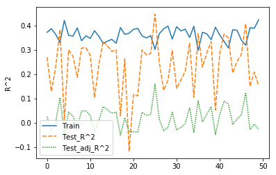
At this point I could only loosely argue that my model was performing better than if had simply predicted the mean dispensary revenue every time. Plenty of room to improve!
Optimizing our model and feature selection with feature scaling and regularization through lasso regression
This is the point where I entered the iterative phase, which basically meant living in a feedback loop bouncing back and forth between model experimentation and feature engineering—until it didn't seem like I was going to get performance much better within the time constraints at hand.
To do this, I wrote a pipeline function to perform the following steps:
- Import processed data into a Pandas dataframe
- Scale each feature by subtracting off its mean value and dividing it by its standard deviation.
- Split the dataframe ("randomly") into a training set containing 80% of the observations and a test set containing the other 20%.
- Stash the 20% test set far far away where my model couldn't see it.
- Instantiate a regression model through sci-kits learn. I used:
- Linear regression
- Ridge regression (with alpha parameter)
- Lasso regression (with alpha parameter)
- Perform a 5-way cross validation split on the training data (so splitting it further into 5 groups, each containing 80/20 split of the 80% training set.
- Train the model on each cross-validation training set, then compute error metrics using the cv test sets.
- Take the average error over the set of 5 runs and log that in a report to be referenced later when comparing models.
With that framework in place, I proceeded to subject my data to a battery of experimental models. Because I knew that I have way too many features for such limited data, I decided to try out ridge and lasso regression regularization methods as their cost functions are effective for reducing feature count and suppressing multicollinearity, which I certainly had plenty of.
Though sklearn has functions in place (RidgeCV and LassoCV) that automatically optimize the penalty hyperparameter ${\lambda}$ (or $\alpha$ within sklearn) through cross validation, I decided to recode the process by hand. Because like they say, reinventing the wheel is the best way to know your way around it. I mean, I bet somebody's set that before.
So I set up a for loop to iteratively run models on the data while tweaking the value for $\lambda$ on a logarithmic scale until I'd identified the range of values that tended to minimize the mean squared error of the model when run on the test data. From there I modified my range and zoomed in until I'd identified values that seemed "optimal enough" (90.658 for ridge regression and 0.0172 for lasso). It was time to make a choice. The results of final runs with each model are copied below.
| Model | Rows | Cols | Target | Train R^2 | Test R^2 | MSE | RMSE |
|---|---|---|---|---|---|---|---|
| Ridge regression | 291 | 67 | log_total_sales | 0.5026 | 0.3439 | 0.0977 | 0.3126 |
| Lasso regression | 291 | 67 | log_total_sales | 0.4676 | 0.3782 | 0.0931 | 0.3051 |
Their performance was close, but ultimately I chose the lasso regression as my preferred model for this situation both because it performed better in terms of my error metrics an also because it has the effect of actually zeroing out the coefficients on underperforming features rather than just suppressing them to low values. This feature strikes me as just a touch better generalization and more easily interpretable, too.
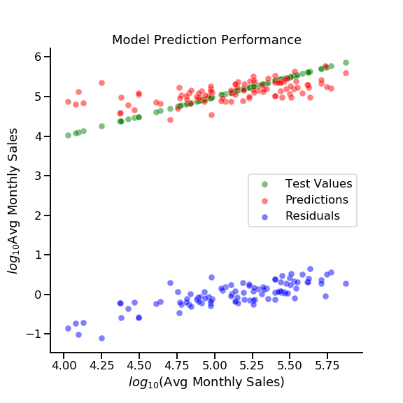
Final model selected, I went ahead and dug up my true test data from the vault and ran a final prediction on the as-yet-unseen test data.
| Model | Rows | Cols | Target | Train R^2 | Test R^2 | MSE | RMSE |
|---|---|---|---|---|---|---|---|
| Ridge regression | 291 | 67 | log_total_sales | 0.5026 | 0.3439 | 0.0977 | 0.3126 |
| Lasso regression | 291 | 67 | log_total_sales | 0.4676 | 0.3782 | 0.0931 | 0.3051 |
| Final lasso regression | 291 | 67 | log_total_sales | 0.4546 | 0.3781 | 0.1094 | 0.3307 |
Slightly worse than our cross validated results, that's to be expected. While we've reached a model that is certainly more robust than our original regression, our performance is still lackluster. There's obviously plenty of room for improvement if this ever gets picked up again.
So What Insights Can We Glean?
misc, number_of_reviews, population_in_group_qrtrs, population_density
Descaling and translating our coefficients into terms we can understand
| Features | Scaled Coefficients | Unscaled Coefficients |
|---|---|---|
| log_number_of_reviews | 0.15479356 | 0.22254295 |
| log_population_density | 0.07910167 | 0.09257050 |
| prerolls | 0.02178097 | 0.00023536 |
| owner_occupied_housing_units_# | 0.01376879 | 0.00000379 |
| all_products | 0.01267409 | 0.00002623 |
| log_population_in_group_qrtrs | 0.01068558 | 0.01412068 |
| number_of_reviews | 0.00977085 | 0.00007235 |
| per_capita_income | 0.00622086 | 0.00000056 |
| misc | 0.00205136 | 0.00001326 |
Future Work
- Collect more data
- More extensive exploratory data analysis
- Time series projections
- Look at revenue growth as a target variable
- Experiment with different models
- Suggest optimal locations and product lines
Comments
comments powered by Disqus